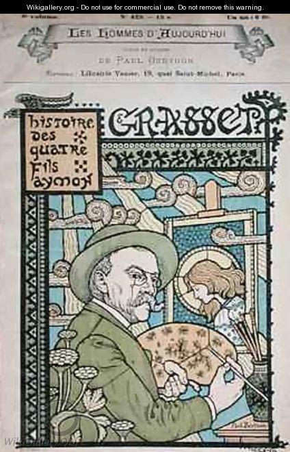
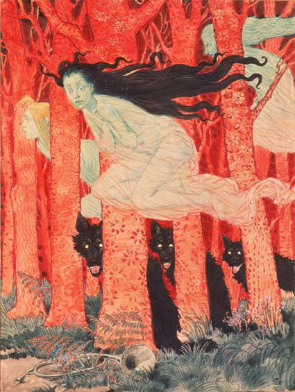
 So, the title tells it all in a nutshell. I just couldn't find what I wanted at the stores and nothing on line that I wanted to pay any money for. The more I looked the pickier I became. Nothing held a candle to my "The Art of Ornament" from the Museum of Fine Arts, Boston calendar that I have been able to buy for 2 years straight. None to be had at the stores this year. So I decided I was going to let the artist, Eugene Grasset- that did the art work in them -be my inspiration. As you can see I flourished. It just sprouted out of me and in such a lovely way. Some of you might remember my sandals that I used Sharpies on a while back. I decided to do the same, in a sense. I bought untreated canvas material and bought a big set of Sharpies. Then went to town.
As I was working on the color I was careful to keep continuity in my colors. Notice how I tried to use the same colors more than once (almost all) throughout my composition. This gives movement to the design and keeps the eyes wondering around to discover, hopefully, new delights constantly.
At the end I scrutinized it and realized that part of the success in the sandals was the thin ballpoint outline I used that make things stand out. I hope you'll notice that I only used it sparingly as I wanted some edges to be soft and recede more. This made some of the designs, the stars of each picture, pop out.
You know, I feel quite happy about this. Oh, the calendar part. Well, I left some extra white material that I didn't draw on that I'm going to just put a new month on when they change. I just can't keep up with this every month. That seemed a little obsessive to me.

Art History Moment: Yes, finally here's one. Eugene Grasset, it turns out, is one of my favorite decorative artists that was reintroduced in the 1960's. He was part of the Art Nouveau (spelling please?) in France during the late 1800's and early 1900's. I forgot that I love this style!  Actually Grasset was born in Switzerland and moved to Paris. He was heavily influenced by Japanese prints, Near Eastern art and medieval stained glass. At first he worked in textile designs and graphic ornament. Then branched out to bigger projects. He taught at the Ecole Normale d'Enseignement du Design school. A big believer in using forms from the natural world-he wrote and illustrated the book "Plants and their Application to Ornament".
 Actually Grasset was born in Switzerland and moved to Paris. He was heavily influenced by Japanese prints, Near Eastern art and medieval stained glass. At first he worked in textile designs and graphic ornament. Then branched out to bigger projects. He taught at the Ecole Normale d'Enseignement du Design school. A big believer in using forms from the natural world-he wrote and illustrated the book "Plants and their Application to Ornament".


