Showing posts with label art history. Show all posts

Friday, January 25, 2013

So this is how I'm doing it now.....

Austin DeuelAustin Deuel

Austin Deuel is an artist noted for his sculptures and paintings.  He's also featured in a book that I love called "Being an Artist" by Lehrman.  I may have written about this book before.  Anyway, it's a book that is so great to read if you're feeling discouraged about producing art and in a rut.  All these successful artists, at one time or another, have struggled to become successful.  They also impart little pearls of wisdom to give any creative person a shot in the arm.  I love what Austin says about what makes a painting sell:

"1.  Tell a story.  Like that Andrew Wyeth painting.  A water pump, a board, and an old bucket.  The bucket is the story.  Because it puts the human touch to it....Smoke out of a chimney, light in a window.

2.   Create a dramatic mood.  Fog. Snow. Rain. Sunset.  Even the heat of day with all the shadows burned out.

3.    Dramatic composition.  Every painting has to have a strong vertical in it.....every artist from Michelangelo to Tiepolo...they all used strong verticals.  It's what draws you across the room, and it has nothing to do with style or subject."

I agree with Deuel's concept 100%.  I may have told this story before but here it is again.  Years ago when I first started my house paintings I was dang proud of them.  Then one day a coworker of my husband's came over and took a look at my portfolio.  He was a real character, this guy.  The kind of person that could be quite blunt.  After looking at my glossy pics he asked me, "Why?"  I asked him what he meant and he asked what was the point of all the paintings.   I said I had done commissions for people and that's what they wanted:  photographic paintings.  I, honestly, was a tad peeved about his comments but through the years I'm glad that Brent said that to me.  I needed someone to get me thinking about truly becoming creative.  Deuel's theory is part of my reasoning.   

I hope when you all look at my paintings you'll see a story.  In "Julie's All About Blue 1" you'll notice the wind blowing through my hair.  This adds just a hint of atmosphere.  It's obviously Spring and that's why I put in the tulips.   You don't see my face but I'm very deep in thought.  Here's the story about how I made this a more meaningful composition.  Years ago I was in church and feeling sort of alone, I guess.  I must have been going through a moody phase and did this drawing.  I don't know if I've ever mentioned this but I've always said to keep any doodles and sketches you do because someday you might want to use them in some way.  Here's a perfect example.  I remembered this when I was getting into this little house painting and I asked myself, "why?"  I needed to put the story in.  Now I don't have a dramatic angle but there is somewhat of a tilt to the bench and that helps create a different perspective to draw the eye in better than just straight on.

As I said in my title-this is how I'm doing it.  What I mean is that I'm going to post to Facebook after I post as I think more people will see my blog that way and I love sharing about my art (as well as other things).  I hope this is successful and I can spark something in someone.  Even if it's to go out and carve a totem pole or something.

Thursday, January 27, 2011

When you don't like the calendars-I say, "Make your own" with Sharpies!


So, the title tells it all in a nutshell.  I just couldn't find what I wanted at the stores and nothing on line that I wanted to pay any money for.  The more I looked the pickier I became.  Nothing held a candle to my "The Art of Ornament" from the Museum of Fine Arts, Boston calendar that I have been able to buy for 2 years straight.  None to be had at the stores this year.  So I decided I was going to let the artist, Eugene Grasset- that did the art work in them -be my inspiration.  As you can see I flourished.  It just sprouted out of me and in such a lovely way.  Some of you might remember my sandals that I used Sharpies on a while back.  I decided to do the same, in a sense.  I bought untreated canvas material and bought a big set of Sharpies.  Then went to town.

I want to tell you that pencil eraser doesn't erase well at all on canvas.  So I learned from that and did some sketches in my trusty work book-I mean sketch book (remember remember?).  I also figured out my color scheme.  Being a big believer in using your own photos when necessary I went through a bunch of my flower pics that I had taken.  Then used some unusual flowers that had meaning to me.  So, folks, these are all my own original designs (please keep that in mind, right?).  After I made my plan I carefully drew it out.  Then the fun part began.  Because of the nature of the untreated canvas lovely textures developed that I wouldn't have even known.  I had no idea how much you could use these markers like regular paints.  The bleeding characteristic of these pens lent itself to a more watercolor type look.  I loved it!  Plus you can blend the colors (you're welcome, Sharpie company).

As I was working on the color I was careful to keep continuity in my colors.  Notice how I tried to use the same colors more than once (almost all) throughout my composition.  This gives movement to the design and keeps the eyes wondering around to discover, hopefully, new delights constantly.

At the end I scrutinized it and realized that part of the success in the sandals was the thin ballpoint outline I used that make things stand out.  I hope you'll notice that I only used it sparingly as I wanted some edges to be soft and recede more.  This made some of the designs, the stars of each picture, pop out.

You know, I feel quite happy about this.  Oh, the calendar part.  Well, I left some extra white material that I didn't draw on that I'm going to just put a new month on when they change.  I just can't keep up with this every month.  That seemed a little obsessive to me.
http://www.vandaprints.com/lowres/39/main/6/319860.jpg

Art History Moment:  Yes, finally here's one.   Eugene Grasset, it turns out, is one of my favorite decorative artists that was reintroduced in the 1960's.  He was part of the Art Nouveau (spelling please?) in France during the late 1800's and early 1900's.  I forgot that I love this style! http://www.wikigallery.org/paintings/205001-205500/205141/painting1.jpg Actually Grasset was born in Switzerland and moved to Paris.  He was heavily influenced by Japanese prints, Near Eastern art and medieval stained glass.  At first he worked in textile designs and graphic ornament.  Then branched out to bigger projects.  He taught at the Ecole Normale d'Enseignement du Design school.  A big believer in using forms from the natural world-he wrote and illustrated the book "Plants and their Application to Ornament".
http://media.tumblr.com/tumblr_lcx2orZ9Ei1qbauf8.jpg
Poster artists during the 1960's reinterpreted his style to modernize it.  I can remember many a rock concert poster that had the same feel to them.  They were just what a fairy tale lover (me) from that era would love to own.  And I did.  I wish I had them now.  Drat.

Wednesday, October 20, 2010

cool cool art made from photography paper and clips

 
I just had to show all of you this really really neat sculpture.  It's so beautiful and you've got to see the rest of it on my daughter's blog, http://blog.shoplet.com.  There are more pictures of the whole project that are unbelievably beautiful.  I wish I had thought of this.  In a way it makes me think of Chihuly.  He does the most incredible glass sculptures.  When we had the 2001 Olympics in our fair city of Salt Lake they had an exhibit of his work in Symphony Hall downtown.  After the Olympics they purchased one of his sculptures.  It's fantastic and is in the entry way.  It sure is a talking piece that I never tire of.  Come to think of it we saw a show, probably on PBS, of his workshop and how they blow the glass.  If you can locate that you'll be very entertained.  It's so dangerous!  I don't know how they do it.
Light Exhibit

Tuesday, June 1, 2010

Guernica - What has always stuck in my mind about Picasso

 http://madamepickwickartblog.com/wp-content/uploads/2010/02/picasso14.jpg
Okay.  There is a work of art by Picasso that I just always think about.  It's called "Guernica". It's a painting about the bombing of the city of that name in Spanish Basque country in 1937 by the German and Italian forces.   It was ordered by the Spanish Nationalist forces during the Spanish civil war and led by General Francisco Franco.  The little village was kind of like a "testing site" for German bombs.  A precursor to the Blitzkrieg of Germany.   In other words-it was bombed to smithereens.  Picasso was commissioned for a large mural in the Spanish exhibit of the 1937 World Fair in Paris.  It struck a cord in the world of the horrors of what a human can do to another human being.  It's such a graphic representation.  While it's not what I'd like on my wall-it really does fulfill an artistic mission to try to better this world.  I have never been able to get it out of my consciousness.  Now it can be stuck in yours.

It must have inspired me in some way when I did this small drawing a few days before 9/11. You can read about it in my post earlier on (I think I mentioned it twice before this).  You all might think that I copied Picasso but I really wasn't even thinking of him when I did this.  It was truly an inspiration from my feelings over the horrors in Ireland-the little children that had to be guarded on their way to school.  Then, like I said, 9/11 happened I think 3 days after I did this.

Tuesday, May 18, 2010

Pushing the limits and Big Daddy Roth


I came across this delightful characterization of Cliff last night and couldn't resist posting it on my blog.  I had so much fun turning his head into a triangle.  Now I think I could push it further and just might do it.  It's fun to exaggerate a drawing as much as possible.
http://imagecache2.allposters.com/images/pic/IMPO/ST5058~Rat-Fink-Posters.jpg
Art History Moment:  Don't you just love how unorthodox I am about this?  It's not what you think?  Right?  Anyway, I got to thinking of a cartoonist that I loved when I was in the 6th grade-Big Daddy Roth.  His cartoons were everywhere in the mid '60's and you could get these really cool models of his creations.  My favorite was "Rat Fink".  This was definitely not a girl thing to do back then but I was a little kookie for a typical girl.  I loved putting these together.  Dang it but I don't have a single one now.  Big Daddy's work really appealed to the surfers and tied in with hot rod cars. You know-everything that went along with the Beach Boys and Jan and Dean.  Unfortunately he passed away but it's possible to see his images if you Google them.  Another cool thing is that his wife runs a museum of his work that is right smack dab in my state of Utah!  Actually in Manti, Utah.  I didn't know that and now I'm going to have to go check that out.  Incidentally Manti is home to one of the most beautiful LDS temples.  Just a gorgeous setting and old time architecture on a hill.  

I know.  I know.   He's not Rembrandt but he was an American original and back then there was nothing like this.

Monday, May 3, 2010

Thoughts on Education

 http://www.rembrandtonline.org/Aristotle-with-a-Bust-of-Homer-1653.jpg
Yesterday I finally got myself to get out all of my old "stuff".  You know the stuff I'm talking about that us girls like to keep-cards, pictures, articles, event tickets.  Well, it wasn't all my stuff because a lot of the stuff is everywhere around the house in little nooks and boxes.  But I felt I could handle taking care of this.  That means sorting and organizing.  A long with that I wanted to weed out 95% of it to make it less stuff.  Well, you know what happened.  I just couldn't quite do it.  I got rid of probably 25% but these people that wrote these notes, etc. were talking about MY life!   And from their treasured viewpoints.  Well, I just organized it all into envelopes and stuffed all of them back into the filing cabinet from whence they came.  But I did get rid of a little.  It always takes sooooo long to do this because you have to stop and reread almost everything.  That's why I dread it but, as usual, I came across treasured items.

I want to share one of these with you.  It was just a little piece of paper that I had cut out from who knows where:

"Herein lies the real value of education.  Advanced education may or may not make men and women more efficient; but it enriches personalty, increases the wealth of the mind, and hence brings happiness.  It is the finest insurance against old age, against the growth of physical disability and against the lack and loss of animal delights.  No matter how many there may be in our family, no matter how many friends we may have, we are in a certain sense forced to lead a lonely life, because we have all the days of our existence to live with ourselves.  How essential it is, then, in youth to acquire some intellectual or artistic tastes, in order to furnish the mind, to be able too live inside a mind with attractive and interesting pictures on the walls.  Learning is an ornament in prosperity, a refuge in adversity and a provision in old age."  -Aristotle

I've had people that have asked me why after so many years I would want to torture myself with going back to school.  I look at them wondering why they would be so silly.  Yes, it is hard.  And, yes, the first time I had a test I said to myself, "WHY AM I DOING THIS?!?  I FORGOT HOW HARD IT IS!"  But once I kicked myself a few times I settled down to doing something I've always enjoyed-learning.  I love to learn.  I love to read.  I've always loved it.   I've always loved the things that go along with it like office supplies-new notebooks, pencils, erasers.  I can't imagine falling in love with a Kindle, or something like that, like I would a brand new ever so fragrant book.

I don't care what happens to me (well, yes, I do-I'm just getting carried away here) if I can still read and learn I will be quite satisfied.  I have a vivid picture in my mind of my stepfather in the care center.  He had macular degeneration so bad that he had to use a magnifying glass to read.  But that man, until the day before he died, still was as sharp as a tack.

Now, if you are reading this now you are one lucky person!  I can't remember the percentage of illiterate people there are in the world but there are millions.  We have been blessed to have this skill.  Why are we so lucky?  I don't know.  Maybe it transfers to the other side someday.  That's what we believe in our church.  The learning we do now is more than important.

So, I plan to keep learning.


Art History Moment: 

Of course it's about the painting at the top of this blog.  "Aristotle with a Bust of Homer" by Rembrandt.  Rembrandt is such a master at creating mood with lighting.  His images are so 3 dimensional and you get the feeling that they have always existed on the painting support.  In this painting there aren't many colors but it's not needed to convey the feeling of intelligence and humility. Two extremely brilliant philosophers.  In order to be teachable you have to be humble.  Aristotle and Homer must have been humble men as they absorbed so much knowledge and wisdom in their lives.  It's hard to believe that the quote above was written so many centuries ago because it's as modern as today.  Don't you agree?  Wow!  Just had to add this after I looked at the painting again.  It's the perfect triangular composition!  Notice how the eye is constantly led around the painting never stopping at one point.  Cool.

Thursday, April 29, 2010

Mosaic with broken china-new project!


I am having just toooo much fun now that I'm out of school.  I have a spot above my kitchen sink that really could use a little personality.  As you can see it's a long narrow strip.  So I thought a broken china mosaic would be just the thing.  It will be my biggest mosaic project, yet, but I'm up to the task after doing all of the broken china hearts (see earlier posts to view some and also a tutorial).  My daughter is a terrific photographer and she took a pic of some flowers that we gave her for graduation quite a while ago.  I'm going to use that as my starting point for the composition.  Normally, you know what a stickler I am for getting permission, I would get authorization for using another person's photo but I think my daughter is okay with my using this.  After all she might end up with the mosaic someday-maybe as I have 4 kids. She has a better chance since it's from her idea.  
So, my first step was to measure above the sink and decide how I thought it should look.  Artist that I am-I thought, "Oooooh.  smaller related mosaics on either side would be so pretty also!"  So, I'm going to make the main one a little smaller than I had originally intended.

Above you can see some of the china I needed and the pic.  Locating the orange china was really holding me back but I found some-plus some glass plates.  I love to mix the china and the glass because the glass gives the work sparkle.  Oh, your local thrift store is your best bet.   It's so entertaining because you can tell them not to worry about wrapping it carefully.  You'll get an odd blank stare that really is funny! I always have mercy and tell them I'm an artist.  Then they get it.

This second step I do love so much-even though it's messy and noisy (not a big fan of messes).  SMASHING THE CHINA!
Here is where you can take out all your aggression for the week.  So, you might want to save this event for when you are really needing it.  When I first started doing the hearts I had lots and lots of china to smash.  It got old after a while because I wanted to get it done and clean up the mess.  I like the paper bag because it seems to be thick enough to do several pieces before you have to get a new one.  Don't worry about having the right sizes and shapes because you won't know until you start the design what is needed.  You can adjust them later with the tile cutter (that you will definitely need).

There.  That's better.  Left brain artist that I am I like things to be orderly or I just go nuts.  I really like the thick paper plates because you can fish through them for pieces but BE SURE TO WEAR GLOVES when you go fishing.  I have gotten some nasty little cuts because, after all, isn't broken glass and china dangerous when it breaks in the kitchen?  Yeah.  You know it (sorry I fall into the stupid lingo of our household but we have fun!). 
Step 3: You can see under the plates the white sheet of paper?  That's where I'm going to build my design.  Notice I've left a border around it in case pieces fall off.  It just gives you something to slide your work around if you need to move it.  Now if you were REALLY organized you would have the wood for the finished piece underneath that you could lay the paper on top of and pick that up if you need to.  But I don't know if I would go to that trouble yet because, whoever is cutting the wood, might be crabby about helping you and that would further delay your work.  Okay.  I know.  I know.  But I have my husband do it because he is sooooo good at cutting wood (notice I keep him thinking that?) and I don't want to go into his domain unless I have to.  He has other thoughts about neatness in the work area.  He's an electrician and you can well imagine all the stuff he has pulled out all the time on the work bench.  That's his job.  Anyway, you might change your mind about the size, etc.  Good to wait, I think.

So, not we, I mean I am ready to begin.  I haven't yet because I'm working on my horse/cat painting at the same time.  Oh, I also have the flower painting going.  See how smart this is?  When I get bored, stuck, mad at one of the projects I can just turn around and do something else.  This is so freeing and sometimes you've go to take that break to see things differently.
http://www.uncp.edu/home/rwb/black_death.jpg
Art History Moment:  Just reflecting on my class I came across some works from the Gothic period of the 1400's.  This is that excruciatingly awful time of the Black Death.  Yuck.  That's why I love art history.  You can't study the art without the history along with it.  These poor people.  They didn't realize that it was their sanitary conditions that brought it on.  The rats thrived on it.  Even if they didn't have a problem in their particular village-all they had to do was get something off a ship from Asia and take it home to spread the disease.  There were lots of rats on the ships.  So gloomy, I know.    So here we have a print from the 1400's.  It's European and I can't tell you the artist (it looks like possibly German? A woodcut or etching?)  I learned in my Human Heritage class that along with the plague came the witch burnings.  Some anthropologists think they were a scapegoat to take the attention off of tithing and noble excesses.  Interesting?  Marvin Harris, noted anthropologist, says that the church and the ruling element invented the witch craze to create a new enemy for the suffering-dying from plague, starving, landless-peasants, to focus their wrath on.  Incredible.  Oh, and it was a good way to keep women under control too.   Did you know that the old nursery rhyme, "Ring Around the Rosies", is all about the plague?  Apparently one of the signs of the sickness was a ring around an area of the body.  The "ashes, ashes...."  well, you know what that means.  Posies?  You got it.  Fascinating.  I love history.  

Friday, April 23, 2010

Grant Clawson: Utah Artist

Well, I had more stuff to put on here today but for some reason my camera won't load onto the computer and Charlie, my son, isn't here to figure it out for me.  Drat.  Must wait until tomorrow but this is the main thing I wanted to post.  Grant Clawson is my neighbor and we are so fortunate to be able to see his work all the time.  Whenever he finishes a major work he invites our neighborhood to come to his studio and enjoy it.  He sets up chairs in front of the painting and answers everyone's questions.  We also get to see all his other great work.  He and his wife, Irma, are very hospitable.  They make everyone feel at home.  Some of the paintings are so large that he has to have a 2 story high ceiling to accommodate them.

I wanted to put a link on here but realized that because this is for a periodical it will change.  So here is the article in it's entirety.  I know it's long but I couldn't cut out any of it.  It's worth a read.  Grant has had some very bad health and Irma was hit by a car.  They are an amazing couple.  Just love them!

 Portrait of President Monson by Grant Clawson and the artist on the right

Portrait of an artist: Grant Romney Clawson
By Trent Toone
Mormon Times
Published: 2010-04-22 00:18:08
MURRAY, Utah -- Grant Romney Clawson is the most famous Mormon artist no one has ever heard of.
For the past 42 years, his brush has created hundreds of precious paintings depicting the Lord Jesus Christ, the prophets, scriptural scenes and other gospel artwork. His works hang in LDS temples and church-owned buildings around the globe.
"I am like a guy who is famous in a way because my paintings are all over the world, but no one knows my name," said Clawson, a self-described perfectionist. "I believe I was born to do this. I feel like the most blessed guy who ever lived. What a privilege to paint portraits for the prophets. It's beyond my imagination. I thank my Heavenly Father every day."
LDS artist Grant Romney Clawson poses with his recently completed portrait of President Thomas S. Monson. The painting will hang with the other presidents' portraits in the Salt Lake Temple. Photo: Trent Toone, Deseret News
Sitting in his home studio on his favorite 50-something-year-old wooden dining chair (one leg held together by a pair of C-clamps), the longtime freelance artist for The Church of Jesus Christ of Latter-day Saints recently completed his portrait of LDS Church President Thomas S. Monson. He devoted approximately 325 hours to perfecting the prophet's likeness on canvas.
The painting will hang in the council room of the Salt Lake Temple next to its 14 predecessors, all but one painted by the 82-year-old Clawson.
"Brigham Young was already there," said Clawson, who is President Young's great-grandson.
Not too bad for a guy who taught himself to paint.
Clawson was first interested in art at a young age, but almost gave up when a fifth-grade school teacher accused him of tracing an assignment he had worked on at home.
"I was very distraught," Clawson said. "I wanted to be recognized as an artist at school."
The heartbroken lad was sitting outside the school reflecting on what had happened when he had a spiritual experience. He said his mind was opened to see a day in the future when he would paint for the temples of the Lord. "From that day forward, I knew what I was supposed to do," Clawson said.
Years later, after serving in the army as a cook in Korea, Clawson had a 16-year stint with KSL-TV. He started as a floor manager and worked up to production manager. He takes credit for discovering Dick Nourse, KSL's longtime award-winning television news anchorman.
Clawson, who has been painting portraits of LDS presidents for decades, poses for a portrait in his Murray, Utah, home. Photo: Kristin Murphy, Deseret News
"My brother was my boss. I told him, you need to see this guy," Clawson said of Nourse.
But Clawson's heart wasn't in television; it was in art.
In 1957, he began painting on the side and entered as many art contests as he could find. The more he painted, the less interest he had in a television career.
One day he was walking through the Salt Lake Temple and saw a 1964 Harry Anderson painting of the Lord Jesus Christ ordaining the apostles. He describes the experience as "an awakening."
In the late 1960s, through a series of events, Clawson was given the opportunity by Elder Mark E. Petersen to paint an enlarged version of Harry Anderson's "John the Baptist Baptizing Jesus." After months of work, it was accepted, and Clawson was commissioned to produce several more enlarged paintings, which now hang along the wall at the North Visitors Center at Temple Square.
The paintings are admired by people from around the globe, like Yair Koshet, a recent Temple Square visitor from the Middle East.
"They are very beautiful," Koshet said. "It's a wonderful idea to tell the story with vivid images. Having lived there, the landscape and scenery is also very accurate."
Clawson also painted the 66-by-14-foot mural titled "Go Ye Therefore" that resides in the lobby of the Church Office Building.
If you look closely at his paintings, you will find the faces of Clawson's family members. Take the face of a sibling, son or daughter, add a beard, long hair and ancient clothing, and you have another subject in a scriptural depiction.
"Jesus at 12 in the Temple," by Clawson, hangs in temples around the world. Photo: Kristin Murphy, Deseret News
"It's the greatest compliment to be in one of his paintings," said Megan Clawson Doezie, Clawson's youngest daughter and art agent. "He has a way of making everyone feel important. It's fun to go to the visitors center and see the faces in the paintings."
While Clawson has produced several original paintings, both religious and nonreligious, much of his church-commissioned work has involved painting enlarged murals of Anderson's smaller originals. Each time, Clawson added his personal touch to small details.
When Anderson saw the size of the mega-canvas in the Church Office Building, he said if he ever had to paint something that big, he would faint.
"He was just trying to make me feel good," Clawson said. "He was a master artist. I learned a great deal from him. He has been a big part of my life."
Clawson has drawn inspiration through the years from daily reading in his Book of Mormon. The influence of the Holy Ghost has also played a role in his numerous paintings.
"I have only missed about 20 days (reading) in more than 20 years," he said.
His other daily chore is to record his hours, details and thoughts in his spiral-bound journal. He has filled 38 such volumes since 1968.
Clawson and his wife, Irma, are the parents of six children, 12 grandchildren and 10 great-grandchildren. They are all big fans of grandpa, but so far no artists have emerged to take up the brush. They have, however, already started to stake their claims on his artwork.
"Rather than watch the family tear each other apart after he is deceased, they say, 'You want it, take it,'" Doezie said.
In addition to LDS art, Clawson has also painted for the western art market. He has even done portraits of some of his grandchildren. For more on Clawson's art, visit grantromneyclawson.com.
Clawson doesn't know how many more projects he will do for the church, but he has enjoyed associating with church leaders and seeing others enjoy his many pieces of artwork over the years. He credits his wife, family and friends for their support.
Perhaps now people will know his name. http://grantromneyclawson.com/
________________________________________

Tuesday, April 20, 2010

Liking/loving what is best in yourself = confidence!

 Julie Jacobsen - My work - too lazy and busy to sign it tonight.  I'll fix it later.  I need to study!

First I want to start with some dandy advice from a great actress, Rita Moreno.  Now, for all of you young kids-Rita was in "West Side Story".  She was not the female star-that role went to Natalie Wood.  But she is a huge star to me.  I'm going to lay it on you right now.  This is her advice for aspiring starts:  Quite your whining, "don't complain.  Get so good at what you do in life that they'll beg you for your services."  She said that on a Thursday as she received a Walk of Fame Star on Hollywood Boulevard.  Wow.  Just soak that in everyone.  These are pearls of wisdom and I need to heed it time and time again.  In other words-don't let the trials in life keep YOU from achieving what is meaningful to you.  Got it?  I hope so.  Will you remind me of it someday if I get whiny?  Thanks.  Now that's a good friend.

That's why I like my drawing above.  Yes, it's another drawing I did in church when I was supposed to be listening and I was.  But I hope you can sense that at the time I drew that I was quite satisfied and happy in life.  I still am.  Remember what I said in a post a long ways back that our sketches really tell how we are feeling about the world?  This one reflects how much I love being a mom.  But I'm not just any mom and I think you can see that also.

 "Country Road Cottage" - LeConte Stewart
Art History Moment:  I want to talk to you about a very famous Utah artist (speaking of keeping it fresh!), LaConte Stewart.  I went to an exhibit of his-he's long since passed away-where they had searched to find as much of his work as they could.  It was held at the Church of  Jesus Christ , Latter Day Saints (us Mormons) Museum in downtown Salt Lake City, Utah.  Talk about inspirational.  I wanted to go home and whip out any old cardboard box and get to work wherever I was (really...don't do that.  Remember our little talk about using the best art supplies that you can afford....think lasting quality...got it?).  Some of the paintings in the exhibit were just that-painted on pieces of cardboard.  They are all about freshness and just going for it.  I hope you can feel that from the sample I have displayed here.  I wish you could have seen these paintings in person.  In the painting, like the example above, you could just feel the heat rising from the road.  Truly wonderful!

Friday, April 9, 2010

Yaaaa-that's what I'm talking about-happy customers

Color sketch for "The Parkin Mansion".  Sorry-I had to take the picture while under glass


Not everyone will want to pick up on this tip but for those of you that are serious about making your customers happy a color sketch before starting the real thing is a wise choice.  It will even save you some, "But I don't like it"(said in a whiny voice), grief.  That equals to, in the long run, time saved, essentially.  When I really became serious about commissions I decided to take this upon myself.  I did a very simple color sketch and went over it with a client to get their thoughts.  The one that I've included in this post is the sketch I've done for "The Parkin Mansion"-which is really the "Christmas Box" house.

 
"The Parkin Mansion".   I have cards as well as prints of this for sale on Etsy (see link)

For those of you (2 in America) that don't know about that book it was a NY Time bestseller by Richard Paul Evans and made into a movie with Maureen O'Hara (hey, she means a lot to the Baby Boomer Gen.).  Anyway, he didn't like the carriage that I had put in the painting.  Now think if I had done the final painting without consulting him and then had to take it off?  Carriages wouldn't be a skip in the park as far as creating them on canvas.  It only took me a small amount of time to do the color sketch carriage-so, no grief here when I banished it from the finale.  As it turned out he liked the painting enough to hang it by his desk in his office (last time I saw) and I went on to do 2 more paintings for him.  It was an incredible experience.  Any of you want to hear more about it-just let me know and I'll tell you about it in a post.  It was just miraculous, no kidding.

Art History Moment:  These are mosaics that Gaudi did in Barcelona and they are unbelievable.  You painting guys-look there's a whole new world of art to explore out there! As I said in previous posts, I did a lot of broken china mosaics last year.  For the few left brainish artists in the world-me for one-that love jigsaw puzzles, well, I can guarantee that you would love to do it.  It's so much fun and one of those things that you go into the studio for 5 minutes and come back out after 2 hours.  It's addictive.  Anyway, just wanted to show you some other aspects of Gaudi-the unusual Spanish artist from around the early 1900's.  I really didn't know about the mosaics until I ran into one of my former customers and he had just been to Barcelona.  He expounded about how much he loved seeing his work.  So, ENJOY!


http://inlinethumb41.webshots.com/21096/2252983900096242728S600x600Q85.jpg

Wednesday, April 7, 2010

Colored pencils add a soft mood on top of acrylics


Do you remember a while back when I talked about Liquitex paints and how I like them a lot because they have more of a matte finish in which oils will adhere to?  I was looking at some pics of my old paintings and remembered that I had layered colored pencils on the acrylics in this painting.  The house was owned by the Coffin family-I kid you not!  It's in the Avenues area of Salt Lake City, Utah.  I was just walking around one day taking pictures of houses that I thought would make a great painting when I came across these cool topiary bushes.  They happened to be next door to this house, actually, but I was able to angle it to look like it was part of their yard.
By the way, this is an excellent example of my layering technique as seen mostly in these bushes-see the red under the green?


  Strictly on the house I used the soft colors of pencils.  It worked really well and actually saved me some time.  I entitled it "Summer Shadows" because of the sultry dreamy feeling I got from the scene.  It is/was a really cool painting.  I sold it.  Actually I traded for contacts from an eye doctor.  I loved the subtle effect the pencils gave the curtains in the windows.  Of course I had to put a good finish on top so the pencils wouldn't wear off.

http://www.cs.columbia.edu/~sedwards/photos/kyle200403/kyle200403-Images/31.jpg
 "La Sagrada Familia" - Antoni Gaudi i Cornet - Barcelona, Spain

Art History Moment:  Alrighty.  I thought it was time to talk about something besides just illustrators.  Have you all heard about Gaudi?  He was an Art Noveau stylist extraordinaire!  Actually he began in the Gothic tradition but soon switched to an organic style that is truly unique.  Someday I'm going to get to Spain and see it in person but it's still so fun to look at pictures of his work.  His most famous is "La Sagrada Familia", a Roman Catholic church that was begun in 1882 and STILL ISN'T FINISHED.  After he died the original blue prints were destroyed in the Spanish Civil War.  But the work continues.  The projected finishing date set yet again (and again and again and again) is 2026-although I've seen something about possibly 2012.  Everything he did has this other world organic quality.  I would almost say it like "Road Warrior Meets the Church".  He was obsessed with this project and it shows.  I was talking to someone that went to Spain and he said that Gaudi did the most interesting mosaics all over the city-in the parks, etc, also.  He is just too cool!

Monday, April 5, 2010

New Monday Art day entry plus something green that I use


"The air was fine and I needed to go to the store-so I decided to fly!"

The word for the week on Monday Art Day is "flight".  I am not kidding but last week I had a flying dream.  I haven't had one of those for years.  It was ME sailing above the trees and when I woke up I felt so good about it.  Then I noticed that we needed to illustrate "flight".  Okay, there was my image.  Yesterday I plopped down while I was listening to Conference and just let it flow (flow as in didn't care about perfection, right?).  Then I thought I would post it today but I was worried about the whole "me thing" with flying and all that.  I didn't want the world to think I was a weirdo a la Freud.  But I Googled flying dreams a lot last night and read how they are interpreted as a great self esteem booster.  In other words you feel free and have overcome difficult odds.  Well, I felt like my subconscious knew me better than my conscious side.  I really did have some difficulties last year and had, I hoped, risen above it all-therefore the flying me.  Okay, there's my feelings about the whole image.  Take it or leave it.


Now I'm just going to talk about the benefits of using a Styrofoam meat tray for rinsing and keeping your brushes wet..  First of all you know you're doing your duty by recycling-green-, right?  I was tired of ruining my paint brush by using a cup.  The tips were always mashed and misshapen no matter how hard I tried to not let that happen.  The trays work great because you just lay the brushes in there and the tips never get bent.  Plus they're free-love that part.


http://www.knowledgerush.com/wiki_image/2/2e/Christmas_Eve_(1904-05)_by_Carl_Larsson.jpg
 "The Christmas Eve" watercolor by Carl Larsson
Art History Moment:  I haven't done this for a few days and it's important to be consistent about the learning end of it.  Today I'm going to talk about another illustrator (tell me if this gets monotonous but I love great illustrators) and one most of you probably haven't heard of.  One of my old friends introduced me to Carl Larsson.  He was a Swedish artist that is famous for the lovely and picturesque paintings/drawings of his family.  He also did commissioned works for his country but I, and many others, I'm sure, think of his home life first when we hear his name.  Anyway, the images of his children are so candid.  You almost feel like you are living in his world whenever you see them by the way he painted from life.  I love the quaint surroundings of where he lived.  You also get to see his wife in her day to day surroundings.  I am told that you can visit his actual house in Sweden and it's been kept in tack with all the gorgeous woodwork that was his original design.  He is just wonderful and you will feel peace and joy whenever you see his work.

Tuesday, March 30, 2010

Subject matter can mean a lot to only you


I thought I would bring up a painting that hardly ever sees the light of day-literally.  "The Housewife's Summer".  It tells my story in so many ways.  Back in the '80's and '90's we lived in an old Cape Cod style house.  The basement truly was a dungeon.  You know what I mean-concrete with old stuff everywhere.  Guess where I spent about 25% of my time?  This sub abode.  With 4 kids there were always mountains of laundry.  One time I picked up some dirty clothes off the floor and a mouse jumped right up and at me.  Now, I'm not afraid of mice but it startled me.  Anyway, I could look up and see outside the window.  Could see the kids running in the sunshine.  Don't get me wrong.  I was thrilled for them but I felt like DOROTHY in the Wizard of Oz.  The basement was Kansas-all dark and dreary.  Outside was Oz-all bright, colorful, cheery, etc.  To top it all off the front of our house faced one of the busiest streets around.  So there was constant traffic-fire trucks, ambulances because there was a hospital west of us.  If you think this picture is an exaggeration, then you would be wrong.  There was even that little orangish  glow around the teeny window.  Luckily this picture is in the past.  We now live on a lovely street where, at last, I can hear the birds chirping.  I can even stand still and hear nothing.  Love it.

Art History Moment - Have any of you ever heard of Minerva Teichert?  If not-you need to look her up.  She was an artist from the early 20th century, born in Utah, and lived her married life in Wyoming.  I was just thinking, "Now, what woman artist that I know about could relate to this painting of mine?"  Minerva had 5 children and lived on a farm. She trained at the Chicago Institute of Art and when she asked one of her teachers why he criticized her art so much he said that he didn't think the other art students would amount to anything but she would never quit producing.   Most of her art is religious and the soul of her works shines through everything she does.  I'm always thinking about her.  Maybe I could be like Minerva and simplify things but still get my point across.  I would have loved to see her sketch book.  I just might someday as from time to time in Salt Lake City they have exhibits of her work. There are some on permanent display in the Conference Center of the LDS chursh, Brigham Young University and the Springville Art Museum.  She was truly one of the best female artists-well, I think she is for that time period.  Good old Minerva probably really slocked the buckets of muck and spent a lot of time in the Never Never Land of her brain.

Wednesday, March 24, 2010

Complimentary colors - what you may not know

 
This is quite rudimentary, today, but interesting, I think.  I had to substitute teach today for 4th grade and they had to work on an art project that involved complimentary colors.  Of course, that reminded me of somethings that I had taught before.  First of all-you all know what they are, opposite colors on the color wheel-if you mix them together by pairs, like orange and blue, you will get gray.  Why does that happen?  There's are terrific book called, I believe, "Yellow and Blue Don't Make Green".  It's not that the colors mix and cause that to happen-it's more like their color rays fight each other.  Blue won't allow the yellow to show up and yellow won't let blue show up.  So you are left with the absence of color - gray.

Now, the grays will be different, of course, because the colors are not the same.  You'll get different results.  If you want a warm gray then combine red and green.  Orange and blue will make a cooler gray-which is great for the shadows in the snow.

Let's try something fun.  I can't tell you why this works but it DOES and every time, at least, for me.  If you take a pure color, like red, and stare at only that, close up, for about 30 seconds-then quickly look at white you will see the complimentary color!  It's a great exercise for children.  They love it but adults get a kick out of it, also.  Ever noticed when you are gazing on a shadow that is kind of colored-like one off a blind-when you look away you won't see that shadow color anymore?  I bet you saw the complimentary color and didn't even realize it!  Try it.
the last supper leonardo davinci
Art History Moment - The reason why Leonardo Da Vinci's fresco's, such as "The Last Supper" are in such disrepair is that Leonardo did not take the right time with his frescoes.  To rush the process he painted in tempura on a dry wall.  This is not actually a true fresco-there can be no corrections as the painting moves forward this way.  Because of this short cut method much of his work was already in disrepair by the 16th century. If he had used the true fresco method of painting into the wet plaster it  would be in a lot better shape today-for us to enjoy!  Luckily we have clever art restorers that have painstakingly tried to recreate Da Vinci's original intent.  Thank goodness for the modern science (and I say "science" because it is) of restoration.  These guys really do make miracles happen.

Tuesday, March 23, 2010

2 must haves for oils


I had another great art teacher for a workshop that I took.  His name is Frank Covino.  Frank had scrutinized all the masterpiece paintings in person that he could and tried to figure out what the old masters used for colors, technique and supports. What he came up with is you have to have Chromium Oxide Green by Grumbacher for all skin (I can't remember if he said darker skin also but I think it would be a good idea).  Wherever there's a shadow or you want to make the skin recede you need to add a little of the C. O. Green.  It's good for an under painting also.  All skin, according to Frank (I'm assuming he meant even darker values) has Windsor Orange by Winsor & Newton.  THAT is the orange you would want to use to mix with the other skin colors.  He also said that wherever you can sense a pulse/blood you need to add a little blood color to that area.  You will enliven the nostrils too if you add some of that blood there also.

2 great colors/2 great tips from Frank Covino.  If you're interested in his workshops I bet he's probably still teaching them.  If you use his method your painting will last at least 500 years or more, many more, because he has a special medium that he has concocted and when applied to a wood panel-well, it's going to last almost forever.  I have one painting I did in the workshop.  It's not a masterpiece at all and will probably last a 1,000 years.  Drat.  Not the one I would choose to go down through the ages.
http://www.ibiblio.org/wm/paint/auth/whistler/i/white-girl.jpg

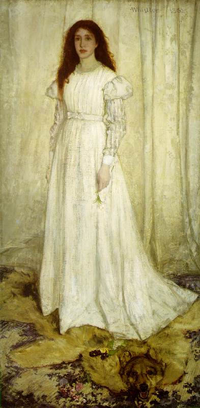
Art History Moment:  Speaking of a retched example to be famous for: Okay.  Who hasn't heard of the portrait "Whistler's Mother"?  Boring (to me), boring, boring.  So when we began studying James Whistler I thought it would be a big drag.  But, unfortunately, that image is what he is well known for.  Whistler was an exceptionally innovative artist in that he was really the first to make use of the influence of Japanese prints.  A fascinating American character that lived in France and London.  In looking at "The Girl in White" you'll notice that he has several "whites" in this painting.  He had the challenge, as I had in "America's Favorite City", of making them look different and stand out.  This girl in the painting is hardly a girl at all but was his mistress,  Jo Heffernan.  What is it with these artist guys?  Does every dedicated male artist have to have a mistress?  I certainly hope not but the mistress/models are the ones that become famous.  After talking so much about Maxfield Parrish, for the life of me, I can't remember his wife's name but I knew his mistress, Susan Lewan.

Sunday, March 21, 2010

This is how I did my entry for "Monday Art Day"


The theme this week is "castaway" and, I don't know why, had this thought flash into my mind.  What if planet Earth got so sick of all our squabbling, environmental abuses and other general bossy/know it all things we do?  I just saw us all tossed into a bag and thrown into outer space.  I know I'm taking liberties with the word castaway and stretching it a little to think it means really cast away.  But, when you think about it, we ALL would be castaways into the void until our mortal lives ended-which would be pretty dang quick!  Just another way of teaching us a lesson besides flooding the surface.

1)  I began by thinking, of course, and realizing that I don't really know what the continents look like.  So, I went down in the basement and dusted off the Atlas.  Then I looked at my previous unsuccessful attempt (from yesterday in one of my sketch/workbooks) and drew a rough sketch.

2)  I added more details-such as the hint of the struggling people in the bag.

3)  I liked what I did.  So, I outlined it with a pen that I like to use because it will sketch without blobbing.  I think it's a Pentel.

4)  I decided that, unlike yesterday, I would add some color.  Out came the trusty bag of old colored pencils. I began that.

5)  In order to give more of a hint of lots of people in the bag I added some quick little hints of faces in color.  I didn't outline them in black because I want them to recede in the background and be behind the main unhappy "character" scrambling to get out.  Life in the bag at this point would be chaotic and mad, to say the least.

6)  At this point I decided whether I wanted to add any color to the sky.  I thought, no, as I wanted only the white to show through my pen strokes.  I wanted the main focus on the earth and the bag.  I thought I would accomplish this by not putting any color in the sky.  Darkening the colored pencils to a high saturation wasn't a route I wanted to take either as keeping it pastel would also stick the focus on the main event.

7)  The color was at the right point.  So, I began to use my pen to create shading and distinction-also to form the body of the sky.

8)  I thought to myself that I was tooooo tight.  So, I forced myself to loosen up and let the strokes fall where they may.  I didn't want to keep this a static and tight composition.  Whimsical was more of what I was thinking.  So, I really went into the zone of letting things happen (scary).  I added some movement strokes to allude to Earth's arm swooshing up to it's nose to pinch it shut and say, "Pee-uuuuu".   Because that's what I pictured would happen.  There are also movement strokes to show the bag swooshing outwards.

9)  (See image at top of post for final stage) All I need to do now is to darken and make sure that things stand out.  I want things like the Earth's arm to stand out and not blend too much but be noticeable.  I scrutinized it and decided that, even thought it's not a masterpiece by a long shot, it says what I want it to say and I HAD FUN DOING IT.  The fun part was important to me because I'm not looking for high stress this week.

Voile!  It's done!!!!! See my post here

Artist Jan van Eyck
Year 1434
Type Oil on oak panel of 3 vertical boards
Dimensions 82.2 (panel 84.5) cm × 60 (panel 62.5) cm (32.4 in × 23.6 in)
Location National Gallery, London


Art History Moment:  Some artists like to put themselves in their paintings-however small they might be.  In "The Arnolfini Marriage" by the 17th century Dutch painter, Jan van Eyck, if you look very closely in the mirror on the wall you can see a teeny tiny portrait of him.  Other painters, such as Norman Rockwell, liked to do that as well.